Brand Evolution
Company
People Data Labs – a B2B data provider that enables technical teams to build compliant, innovative data-based software solutions.
Role
Design Manager
Deliverables
Brand Identity Design, Design Research, Brand Guideline Development, Project Management, Collateral Design
Business & Marketing Goals
Brand Awareness, Scaled Brand Identity
Background
After a year at People Data Labs, I was promoted to Design Manager and began to build out a design team. During this time, the company continued to evolve – doubling it's staff, shipping new products and entering new verticals. While the business scaled, the visual brand had remained the same for several years.
PDL's brand attributes, voice, tone and graphic library no longer served the needs of the growing business. The visual language of the brand did not reflect the company, and there were not enough elements to execute new design concepts.
With the support of executive leadership, I determined that a full rebrand was not necessary, but rather an evolution of the existing brand and the creation of new graphic assets. This solution allowed us to refresh the brand with a limited budget and tight time constraints.
Research & Discovery
The new brand was informed by industry, customer, and employee research. I led the design team in conducting competitive and internal research. I gathered information on our customers and created personas to account for both technical and non-technical decision makers. I combined this information with data from the product and product marketing teams to create our design recommendations.
Identity Design Process
The project was coined a brand evolution because our goal was not to do a complete overhaul of the visual identity. Rather, we sought to add more elements and refresh the existing ones so that the brand could be used more easily across all touchpoints.
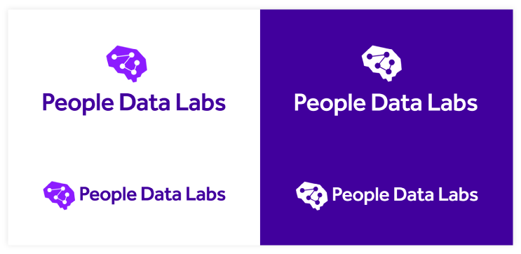
The original logo was iconic, but it was too complex to work well at small sizes. I worked with our illustrator to create a bolder, simpler mark that reads well across all sizes and formats and can also, in specific situations, function on its own.
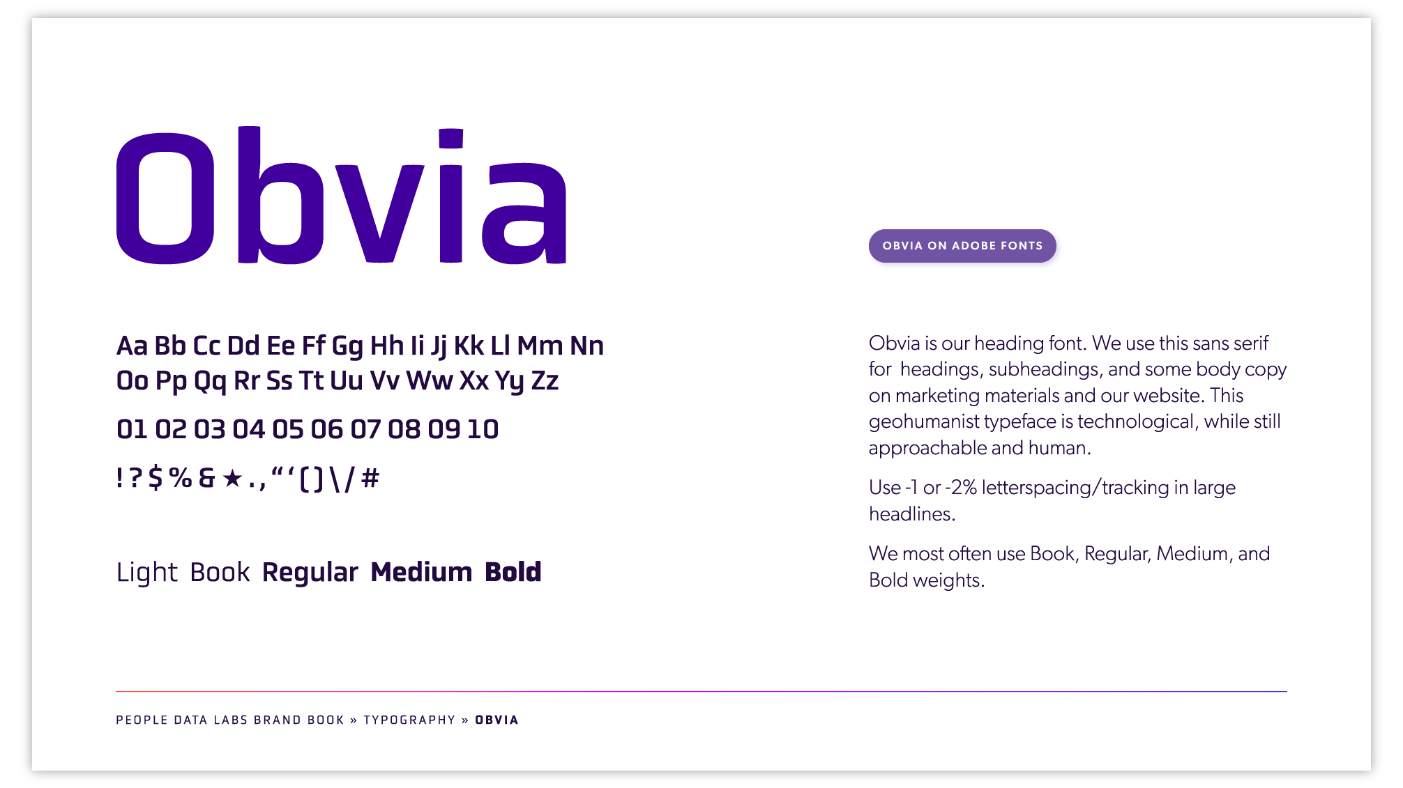
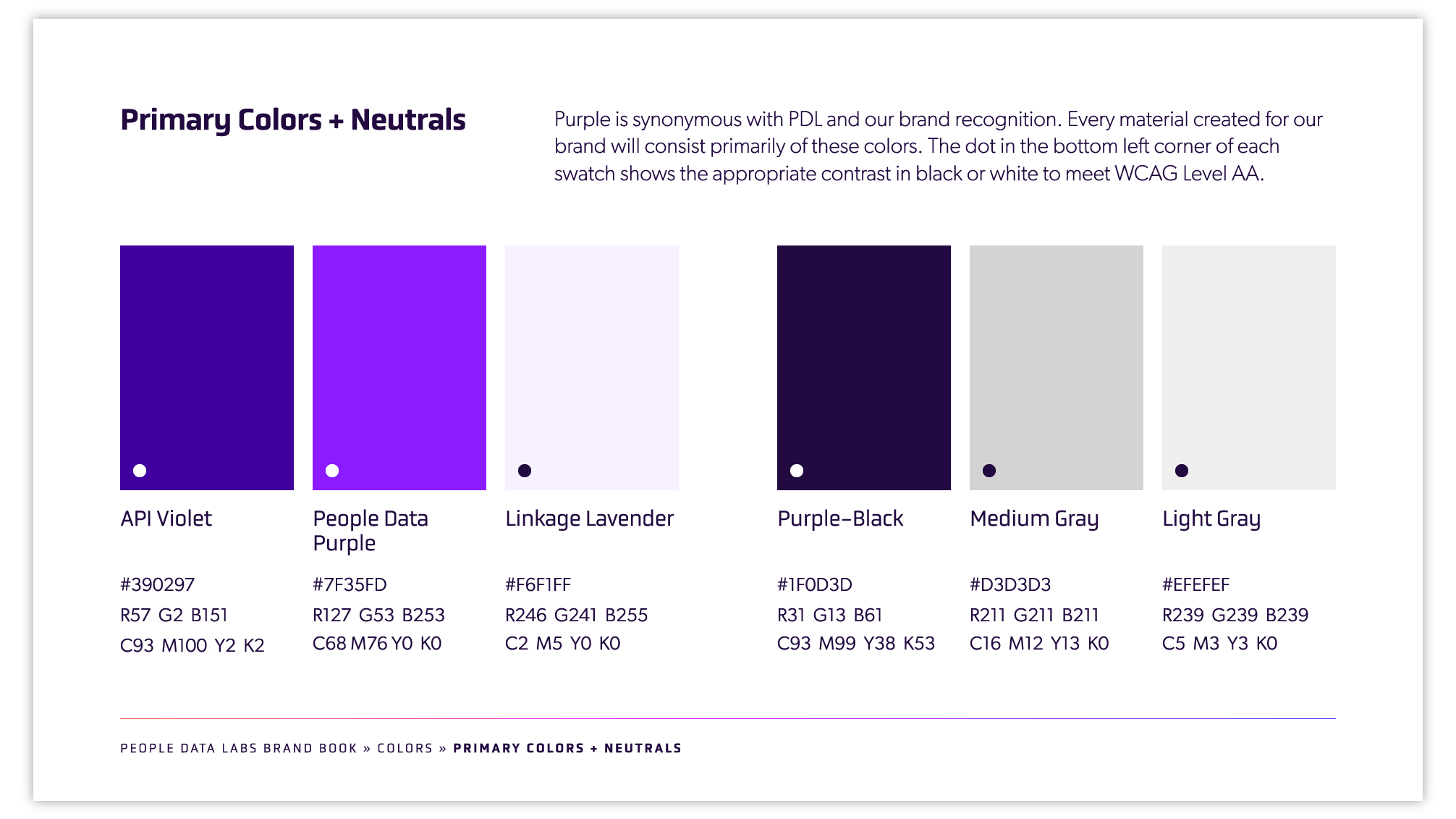
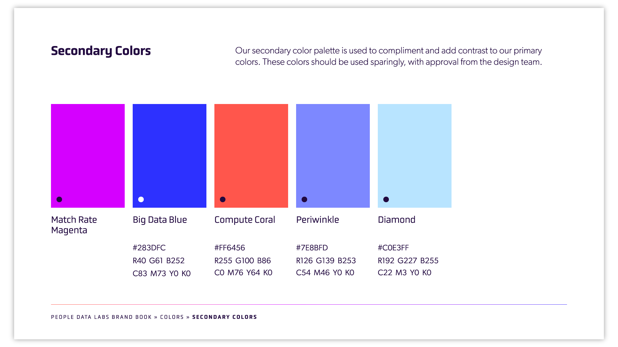
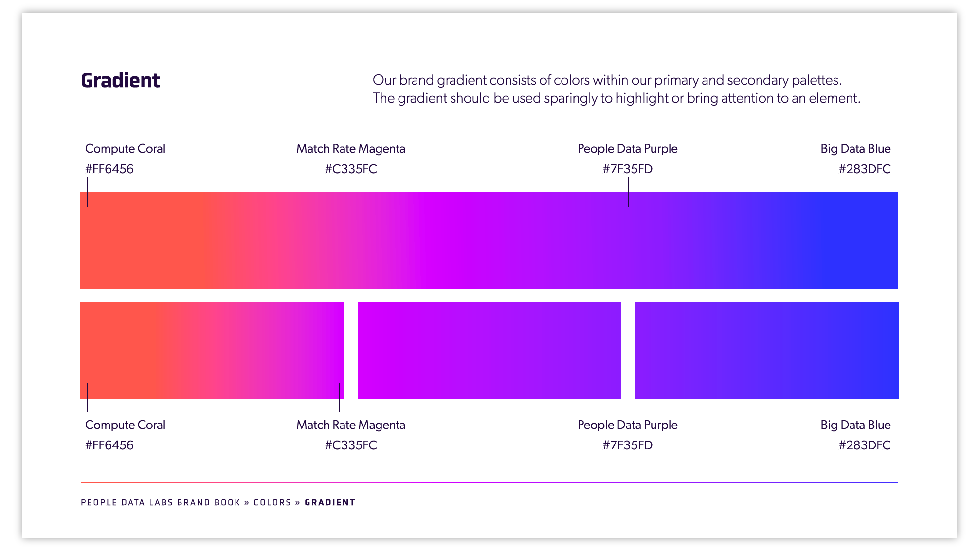
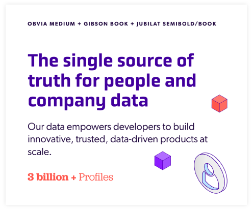
Purple was synonymous with People Data Labs, and I built a bold, bright palette of colors around the purple hue, including gradients and tints that would be used in illustrations, infographics and data visualization. I chose contemporary, tech-leaning fonts for an elegant, versatile typography kit.
I worked closely with one of our design specialists to create new guidelines for animation, video and illustration. These new guidelines were intentional and sought to explain the complex technology and features of People Data Labs' products.
Collateral Design & Roll Out
Over the next several months, I managed and tracked the redesign of all existing materials to align with the new branding. I also communicated with and educated the larger team on how to use the new visual identity.
Before leaving People Data Labs, I created the foundation of a website design system for the future website redesign. I utilized a system of modular components which allowed designers and web developers to quickly design and develop new web pages.
Impact
Armed with a large library of evolved design elements, the team was able to complete project requests more efficiently, as well as develop unique, on-brand and flexible marketing collateral and campaign artwork.
Credits
Graphic Designer: Nate Voyer
Motion Designer: Whitney Souders

